Bokeh Effect Mistakes: 5 Errors That Ruin Your Photos
Is your bokeh effect looking fake? Avoid these 5 common photo editing mistakes. Learn how to fix intensity, blend modes, and light direction for pro results.
Deb Miller
Senior Visual Effects Artist & Photo Editor. Expert in atmospheric overlays, color grading, and digital compositing.

There is a specific feeling you get when you look at a poorly edited photo. It’s uncanniness. Your brain knows something is wrong, even if you can't articulate the physics of it. The lighting doesn't match, the edges are too sharp, or the colors feel vibrationally dissonant.
In my career as a Retoucher, I have rejected hundreds of portfolios for one reason: bad bokeh implementation.
Adding a bokeh effect is one of the quickest ways to elevate a flat image, but it is also the easiest way to destroy it. Because bokeh mimics a physical phenomenon (light refracting through a lens lens), breaking the laws of physics breaks the illusion.
If you have ever stared at your edit and thought, "Why does this look fake?", you are likely committing one of these five cardinal sins. Here is how to identify them -- and fix them using ImagiTool.
Mistake #1: The "100% Opacity" Trap
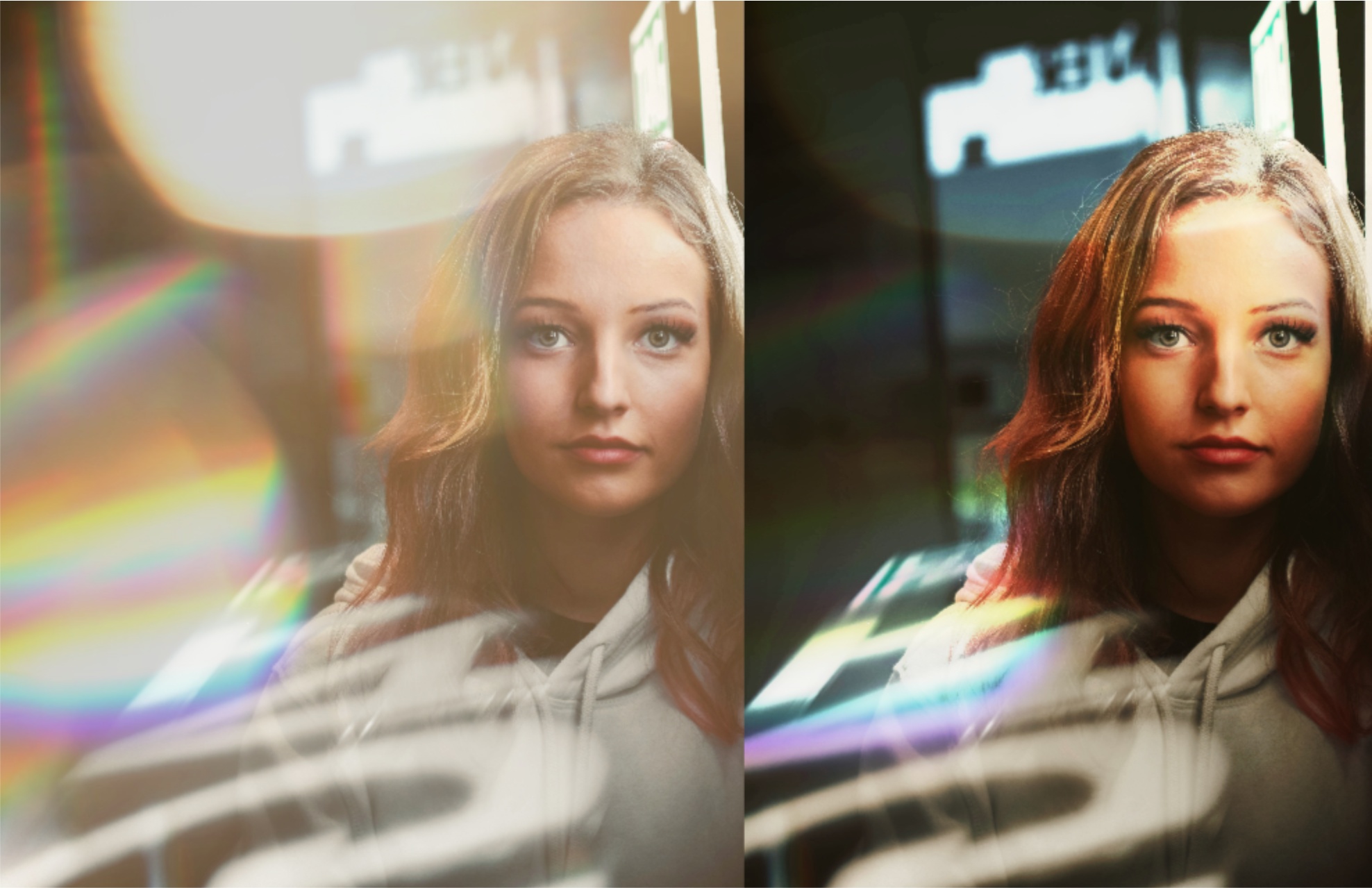
This is the most common error beginners make. You find a beautiful overlay, apply it, and leave the intensity slider cranked to the maximum because you want the effect to be "visible."
Why it ruins the photo: Real light is rarely 100% opaque. Even bright light sources interact with the atmosphere and the lens glass. When you paste a solid, bright white circle over a face or an object, it looks like a sticker, not light.
The Fix: Subtlety is your friend.
- Action: Immediately drop the Intensity slider to 60%.
- Fine Tuning: Adjustable intensity is key. For daylight shots, I often go as low as 30-40%. You want the viewer to feel the atmosphere, not stare at the white dots.
- Pro Tip: If the effect disappears too much when you lower opacity, don't increase the opacity back up. Instead, change the Blend Mode to Add, which increases brightness without adding "thickness" to the layer.
Mistake #2: Choosing the Wrong Blend Mode
I devoted an entire guide to this in Bokeh Blend Modes Explained, but it bears repeating because it is crucial.
The Error: Leaving the blend mode on "Normal". In "Normal" mode, the black background of the bokeh overlay covers your photo. Beginners often try to fix this by lowering opacity, resulting in a muddy, grey, washed-out image.
The Fix: You generally only have two correct choices for light overlays:
- Screen: This renders black transparent. It is the physics-accurate mode for light. Use this 90% of the time.
- Soft Light / Overlay: Use these if you want the bokeh to texture the image without brightening it significantly. This creates a "vintage lens" look rather than a specialized light leak look.
Never use Normal. If you see black pixels, you are in the wrong mode.
Mistake #3: Ignoring Light Direction
This is the subconscious cue that makes an edit feel "off."
The Error: Your subject is lit from the left (shadows are on the right). But your bokeh overlay has a massive light flare coming from the right. Your brain screams: "Where is that light coming from?"
The Fix: Be the director of your scene.
- Analyze: Look at your subject's nose. Which side gives a shadow? The light comes from the opposite side.
- Transform: Use ImagiTool's Flip Horizontal (H) or Rotate controls. Spin the bokeh overlay until its brightest point aligns with the light source in your photo.
- Result: The bokeh now looks like it is caused BY the light source, rather than competing with it.
Mistake #4: Color Temperature Mismatch
The Error: Placing a warm, golden bokeh (like the "Burn Light" preset) onto a cool, blue winter photo. Or placing a cold, blue bokeh onto a sunset photo.
Unless you are intentionally going for a "Teal and Orange" Hollywood contrast, mixing temperatures usually looks like a mistake.
The Fix: Match the overlay choice to the ambient light, or use color grading to bridge the gap.
- For Cool Photos: Use Lilac Blue, Natural, or Crystal. These have neutral or cool white points.
- For Warm Photos: Use Gold Particles, Creamy Yellow, or Burn Light.
- Check Filters: If you really want gold sparkles on a snow photo, apply a Floating dust effect after the bokeh to tint the whole image (creating a cohesive color wash).
Mistake #5: The "Face Block"
We discussed this in our Portrait Bokeh Guide, but it ruins more headshots than anything else.
The Error: Allowing a large, sharp bokeh circle to land directly on the subject's eye, nose, or mouth. In real photography, foreground bokeh usually frames the subject, it rarely blocks the focal point (unless it's an artistic choice).
The Fix: Don't just accept the default placement.
- Flip It: Often, just pressing V (Vertical Flip) will move the offending spot to the corner.
- Change Preset: If "Natural" puts a dot on the nose, try "Minimal."
- Rotate: A 90-degree turn moves the corner flares to completely different positions.
Bonus: Over-Editing (The "Kitchen Sink" Approach)
It is tempting to stack a rain effect, a snow effect, and a bokeh effect. This usually results in a messy, noisy image where the subject is lost.
The Rule of One: Pick one atmospheric hero. Is it a rainy day? Use rain. Is it a magical evening? Use bokeh. As we covered in our initial setup guide, the best edits are the ones you don't immediately notice.
Summary Checklist
Before you hit "Download" on your next edit, run through this quick checklist:
- Intensity Check: Is it below 70%?
- Black Background Check: Is the blend mode set to Screen?
- Light Source Check: Does the flare match the sun/lamp direction?
- Face Check: Are the eyes visible and clear?
- Color Check: Do the light temperatures agree?
Fix these five errors, and you will move from "filter user" to "photo editor."
Ready to practice? Open the Bokeh Effect tool and try correcting an old photo using these principles.

