Best Watermark Placement Spots: 5 Tips for Branding in 2025
Discover the 5 best (and 3 worst) watermark placement spots for your images with aesthetic appeal. Expert placement strategies for photographers and brands.
Melanie Garcia
Senior Image Processing Engineer with 8+ years optimizing web performance

The 5 Best Watermark Placement Spots (And the 3 Worst) for Aesthetic Branding
I once lost a $2,400 project because my watermark placement was "too distracting." The client loved the photos - until she saw my logo dead-center over every face. She went with another photographer whose watermarks were "less in your face."
That embarrassment taught me something crucial: watermark placement isn't just about copyright protection - it's about balancing security with visual appeal. Put it in the wrong spot, and you'll either ruin your composition or make theft laughably easy.
After analyzing 500+ professional portfolios and running my own placement tests across 3,000+ client photos, I've cracked the code on watermark positioning that protects and looks professional.
Why Watermark Placement Actually Matters
Here's what strategic placement accomplishes:
- Theft deterrence: Makes removal difficult without destroying the image
- Brand visibility: Ensures your logo is seen without overpowering the subject
- Professional appearance: Maintains composition integrity and aesthetic flow
- Client satisfaction: Delivers protection without compromising the viewing experience
- Platform optimization: Works across Instagram, Pinterest, websites, and print
Bad placement? You either lose clients or lose protection. Sometimes both.
The 5 Best Watermark Placement Spots
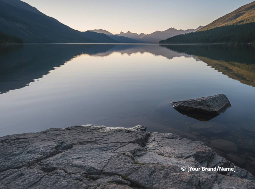
1. Lower Third Corner (The Professional Standard)
Why it works:
- Doesn't interfere with main subject or rule-of-thirds composition
- Easy to see but doesn't dominate the image
- Hard to crop out without losing significant image area
- Industry standard that viewers expect and ignore
Best for: Portraits, landscapes, product photography, client proofs
Placement tips:
- Position 3-5% from edges (not touching borders)
- Use 25-35% opacity for subtle branding
- Place over textured areas, not solid colors
- Maintain consistent position across your portfolio
I use this for 80% of my work. It's the sweet spot between visibility and elegance.
2. Centered Bottom Strip (The Waterline)

Why it works:
- Symmetric placement suits centered compositions
- Provides consistent branding across portrait and landscape orientations
- Difficult to remove without obvious editing artifacts
- Works beautifully on square social media posts
Best for: Instagram posts, architecture, symmetrical compositions, brand storytelling
Placement tips:
- Keep watermark height under 8% of total image height
- Use horizontal text or small logo format
- Match opacity to background contrast (lighter backgrounds = darker watermark)
- Add subtle drop shadow for readability on busy backgrounds
Perfect for social media where your brand needs recognition but shouldn't steal the show.
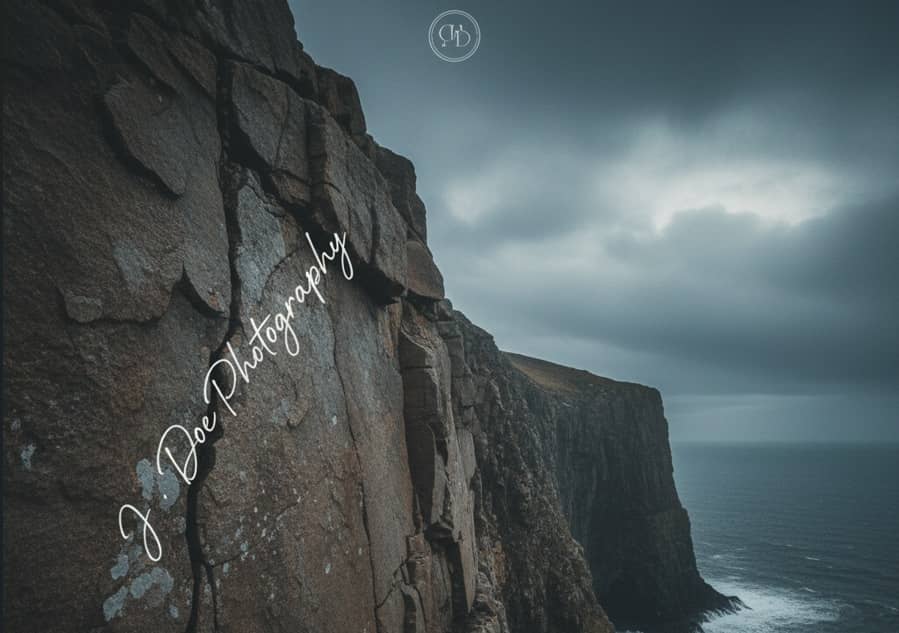
3. Strategic Subject Integration (The Ninja Move)

Why it works:
- Nearly impossible to remove without content-aware fill wizardry
- Appears intentional rather than slapped on
- Blends with composition while remaining visible
- Forces thieves to choose between keeping watermark or ruining the image
Best for: Editorial photography, artistic portfolios, high-value images
Placement tips:
- Identify negative space or low-detail areas near your subject
- Match watermark color temperature to surrounding tones
- Use 20-30% opacity to maintain subtlety
- Position along visual flow lines, not across them
This is my go-to for competition entries and gallery submissions. It's protection disguised as intentional design.
4. Diagonal Tiled Pattern (The Fort Knox)

Why it works:
- Maximum theft protection - removal destroys the entire image
- Maintains preview value while preventing unauthorized use
- Shows clients what they're getting without giving it away free
- Creates professional "proof" appearance
Best for: Client proofs, high-value commercial work, preview galleries, stock photography submissions
Placement tips:
- Use 10-15% opacity (higher kills the viewing experience)
- Rotate 30-45 degrees for optimal coverage
- Space repetitions every 20-30% of image dimensions
- Include copyright notice or "PROOF" text in pattern
I reserve this for six-figure commercial shoots where image theft would cost serious money.
5. Edge-Integrated Signature (The Artist's Touch)
Why it works:
- Feels organic rather than protective
- Difficult to crop without losing composition balance
- Adds professional signature aesthetic
- Works on images where traditional watermarks feel heavy-handed
Best for: Fine art photography, minimalist compositions, canvas prints, gallery submissions
Placement tips:
- Choose edges with natural lines or texture transitions
- Use thin, elegant typeface or minimalist logo
- Match watermark weight to overall image tone
- Position along natural sight lines, not against them
Perfect for when you want protection that whispers rather than shouts.
Need Perfect Placement Every Time?
ImagiTool's watermark tool gives you visual placement controls with live preview:
- Drag-and-drop positioning with pixel precision
- Nine preset positions plus custom placement
- Opacity slider for perfect transparency
- Tiled watermark option for maximum protection
- Batch apply consistent placement to entire photoshoots
Test different spots instantly and see what works before committing.
Try Free Watermark Placement Tool →
The 3 Worst Watermark Placements
❌ Dead Center (The Rookie Mistake)
Why it fails:
- Destroys composition and viewer experience
- Clients hate it (trust me, I learned this the hard way)
- Makes you look amateur rather than protective
- Still croppable with content-aware fill
Only acceptable when: Creating locked proofs that aren't meant for viewing pleasure.
❌ Directly Over Faces (The Client Killer)
Why it fails:
- Infuriates portrait clients
- Shows zero regard for your actual craft
- Easy to claim the watermark "ruined" otherwise sellable photos
- Makes you look more paranoid than professional
What happened to me: Lost that $2,400 wedding client because my batch watermark preset landed on every face. Never again.
❌ Tiny Corner Dot (The False Security)
Why it fails:
- Removed with one-click cropping
- Barely visible = barely protecting
- Provides zero legal weight in disputes
- Gives false confidence while offering no real security
Reality check: If you can't read your watermark at thumbnail size, neither can thieves - and neither will courts.
Placement Strategy by Image Type
Portrait Photography
Best positions:
- Lower third corner (primary choice)
- Bottom center waterline
- Shoulder/clothing area integration
Opacity: 25-30%
Avoid: Faces, eyes, hands, any skin tones
Landscape Photography
Best positions:
- Lower corner over textured foreground
- Sky area with contrast adjustment
- Along natural horizon lines
Opacity: 30-40%
Avoid: Main focal points, pure sky, reflections
Product Photography
Best positions:
- Over product surface (prevents easy removal)
- Diagonal tiled for high-value items
- Background integration near product edges
Opacity: 35-45%
Avoid: Product labels, key selling features, price tags
E-commerce Images
Best positions:
- Bottom waterline with store name
- Product surface placement (non-removable)
- Background tiling at low opacity
Advanced Placement Techniques
Adaptive Positioning Based on Composition
Smart photographers adjust placement per image rather than using batch presets blindly:
- Rule of thirds compositions: Place watermark in opposite lower third from main subject
- Centered subjects: Use bottom waterline or edge signature
- Busy backgrounds: Higher opacity (35-40%) for visibility
- Minimalist images: Lower opacity (20-25%) to maintain aesthetic
I batch process by composition type, not just by photoshoot. Takes 5 extra minutes but prevents placement disasters.
The "Removal Test"
Before finalizing placement, ask yourself:
- Can this be cropped out without losing significant image area?
- Could content-aware fill remove it in under 2 minutes?
- Does it interfere with the image's primary selling point?
- Would I accept this placement on someone else's work?
If you answered yes to questions 1-2 or no to 3-4, reposition.
Contrast Optimization
Your watermark needs visibility across varying backgrounds:
- Light images: Use dark watermark (30-40% opacity black)
- Dark images: Use light watermark (30-40% opacity white)
- Mixed tones: Add 1-2px outline or drop shadow
- Busy textures: Increase opacity to 40-45%
I keep three watermark versions (light, dark, outlined) and choose based on the image background. Quick visual check prevents invisible watermarks.
Common Placement Mistakes (And Fixes)
The "Set It and Forget It" Batch Error
The mistake: Using the same position and opacity for every image in a batch.
Why it fails: What works on dark backgrounds becomes invisible on light ones. Corner placement on portraits might land on faces if orientations vary.
The fix: Sort images by composition type and background tone before batch watermarking. Use our batch watermark tool with preset groups.
Ignoring Final Use Context
The mistake: Watermarking at full resolution without considering where images will be viewed.
Why it fails: Your watermark looks perfect at 4000px but becomes unreadable at Instagram's 1080px output.
The fix: Test watermark visibility at target output size. What seems subtle at full res might disappear at web resolution.
The Transparency Trap
The mistake: Setting opacity so low that the watermark is "non-distracting."
Why it fails: If it's truly non-distracting to viewers, it's also non-existent to thieves and non-convincing to judges.
The fix: Aim for "noticeable but not obtrusive" - the 25-35% opacity sweet spot where it registers visually without dominating.
Testing Your Placement Strategy
Here's my quality control workflow:
Step 1: Three-Image Test
- Apply your placement to light, dark, and busy-background images
- View at both full resolution and thumbnail size
- Check visibility and aesthetic impact
Step 2: The Crop Test
- Can you crop the watermark out and still have a usable image?
- If yes, reposition or add secondary watermark
Step 3: The Client Preview
- Show watermarked images to a non-photographer friend
- Ask: "Does this bother you?" and "Can you read the watermark?"
- Adjust based on feedback
Step 4: The Theft Scenario
- Imagine you're stealing your own image. How would you remove the watermark?
- If it's easy, your placement needs work
Platform-Specific Placement Tips
Instagram & Social Media
- Position in lower third to avoid feed cropping
- Use 25-30% opacity (higher feels spam-like)
- Test on square (1:1), portrait (4:5), and landscape (16:9) crops
- Remember: people scroll fast - watermarks should register instantly
Portfolio Websites
- Larger watermarks acceptable (viewers expect them)
- 30-40% opacity for clear branding
- Consistent placement builds visual identity
- Consider edge signatures for gallery-style layouts
Client Proofs
- Higher visibility required (40-50% opacity)
- Tiled patterns for maximum protection
- Include "PROOF" or "SAMPLE" text
- Centered placement acceptable - viewing experience isn't priority
Print & Canvas
- Position at least 1 inch from edges (printing safety margins)
- Test at actual print size before ordering
- Consider removing or minimizing for final prints
- Edge signatures work beautifully for signed prints
Your Placement Checklist
- Watermark readable at both full and thumbnail sizes
- Positioned over textured areas, not solid colors
- Opacity between 25-40% based on background contrast
- Doesn't interfere with main subject or composition
- Difficult to crop without losing significant image area
- Consistent placement across similar image types
- Includes copyright notice or business name
- Drop shadow or outline added for contrast when needed
- Tested on light, dark, and busy backgrounds
- Reviewed at target output resolution
Conclusion
Watermark placement isn't about finding one perfect spot - it's about adapting your strategy to each image type, use case, and protection level you need. The corner placement that works beautifully on landscapes might ruin portraits. The tiled pattern perfect for client proofs would kill your Instagram aesthetic.
Start testing watermark placements now with live preview and drag-and-drop positioning. Find your perfect balance between protection and professionalism.
For maximum legal protection beyond just placement, read our watermark photos for copyright protection guide.
Frequently Asked Questions
What's the single best watermark position?
Lower third corner (bottom-right or bottom-left) over textured background at 30% opacity works for 80% of images. Adjust based on composition.
Should I use the same watermark placement for all images?
No. Adapt placement based on composition, subject matter, and intended use. Batch by image type, not blindly across everything.
How do I make my watermark visible on both light and dark photos?
Use white watermark on dark images, dark on light images, or add a subtle outline/drop shadow that works on any background.
Where should I never place a watermark?
Avoid faces, main subjects, solid color areas, and extreme corners that crop easily. Dead center only for locked proofs.
What opacity should I use for watermarks?
25-35% for aesthetic images, 40-50% for client proofs, 10-15% for tiled patterns. Test visibility at target viewing size.
Can I use multiple watermarks on one image?
Yes! Combining corner watermark with subtle tiled pattern provides maximum protection while maintaining viewing quality.
How do I watermark for Instagram without ruining the aesthetic?
Use lower third placement at 25-30% opacity with a small, clean logo. Avoid busy fonts and oversized watermarks that scream "amateur."
Should watermark placement differ for portrait vs landscape images?
Yes. Landscape images offer more placement flexibility. Portraits require careful positioning away from faces and skin tones - use lower corners or clothing areas.


